Week 8

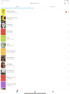
Marco Polo has an easy to follow "don't make me think" structure in that it follows methods we've come to know within all chat formats. It also suggests new "chats" and has non intrusive offerings for enhanced features as well as informational pop ups that allow you to use the program more fully. This Ticket to ride app home screen is cluttered and doesn't clearly indicate where you need to navigate for various objectives. Even though "play" is large and white" I still have to try likely buttons in order to get through to actual gameplay. Additionally, once in gameplay, finding the rules is very difficult.
